Canva is no longer just a design platform. It has changed into a complete visual communication tool used by designers, marketers, founders, and content teams.
While HR manages structured hiring data, designers drive the visual hiring narrative through creative assets. Designers are actively using Canva to streamline, increase, and enhance the user experience by creating amazing designs.
In this guide, our creative team has curated high-value tips and tricks exclusively for designers, so before you open Photoshop or Figma out of habit, wait. Canva enables high-velocity creative production, significantly reducing design time.
Let’s go deeper!
Ultimate Canva Tips and Tricks for Designers
Here’s what this guide will help you create:
By the end, you’ll be professionally equipped to start creating:
- Scroll-stopping job posting banners
- Multi-slide hiring carousels
- step-wise infographic visuals for blogs
- Hiring campaign checklist graphics
- Keyword-rich, high-readability visual templates
- Image-export strategies for job portals; social campaigns
- Canva hidden features most users still don’t know exist
- And even a few designer tricks we won’t mention here — we’ll keep that suspense!
5 Key Reasons Canva Is the Go-To Tool for Hiring Designers Today
- Speed: Banner design that used to take hours now takes minutes.
- Formatting control: Every post can be perfectly resized for feed, story, or portal thumbnails.
- Template reuse: Build once, duplicate forever.
- Mobile readability: Your designs don’t break on smaller screens.
- Portal integration: Simple exports that are compatible with job-portal uploads.
How To Use Canva PHASE #1 (The Foundation Setup)
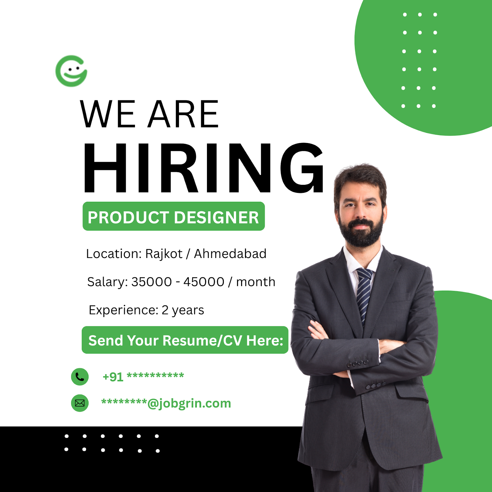
For this blog, we will use a hiring banner as the example. However, you can apply the same steps to create any type of engaging design.
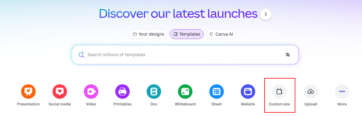
Step 1 – Open Canva and Select the Correct Canvas Size
Many designers choose the wrong canvas type at first, which affects visual clarity later during export.
Go to:
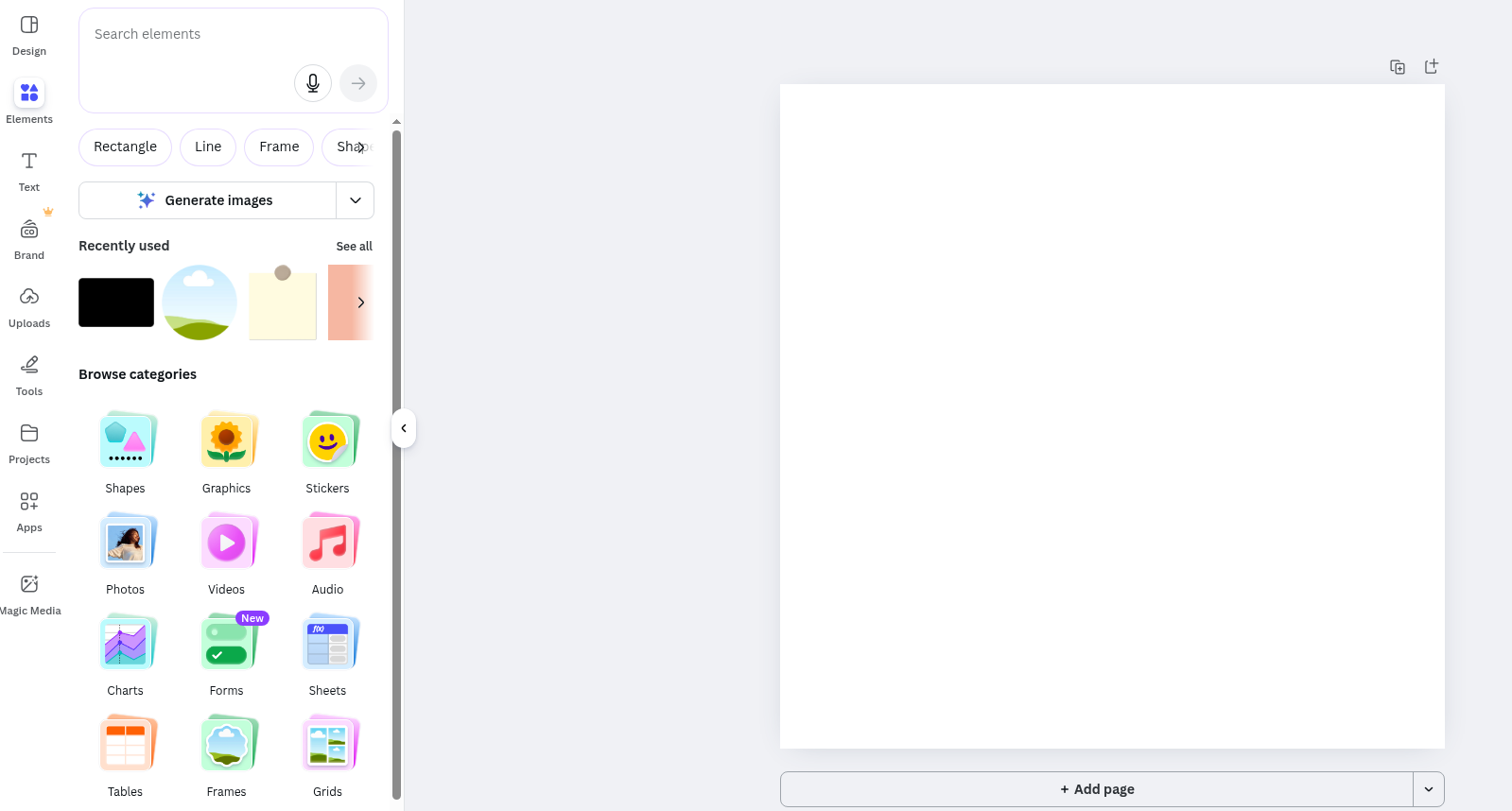
Canva dashboard → Customise Sizes → 1800X1800 px and create
Why this? Because:
- It works for social feed
- It works for job-portal banners
- It fits into most platform thumbnails

Key point: For Instagram specifically, you should use 1800 × 1350 px (4:5) to make sure your post shows fully in the feed without cropping. But for Canva blog slides or multi-purpose images, a square 1800 × 1800 px is a safe default.
Step 2 – Enable Rulers and Add Margin Guides
Consistency in portal creatives is driven by structured alignment, not manual estimation.
Go to:
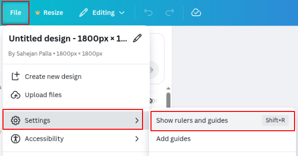
File → View Settings → Show Rulers & Guides → Add Guides for margins
Or simply press Shift + R
Set equal margins:
- Left: 80px
- Right: 80px
- Bottom: 120px (for CTA safety zone)
How Designers Create Real Job Banners (Square Post)
Step 3 – Insert the Job Headline
Top section, single line only.
WE’RE HIRING — PRODUCT DESIGNER
Guidelines:
- Font size: 60–72pt
- Weight: Bold
- Line limit: 6–7 words max
- Placement: Inside top margin guide
Step 4 – Add Meta Information (Short Qualifiers)
Below headline, simple row layout with icon separators:
📍 Ahmedabad | 💰 ₹5–12 LPA | 2+ Years ( according to your location and salary range with experience )
Guidelines:
- Font size: 18–22pt
- Weight: Medium
- Keep salary and location clearly scannable
Step 5 – Add Company/Portal Callout Description (optional)
Small subtext but high readability:
Design the future of digital products.
Guidelines:
- Font size: 14–18pt
- Don’t exceed 2 lines
- Keep this above the CTA safety zone guide
Step 6 – Insert Supporting Hiring Icon/Sticker (Minimal)
Designers can add nodes, people, or abstract shapes, but never clutter.
Go to:
Elements → Search icons → “briefcase”, “user group”, “designer” icons
Placement tip:
- Next to the headline, a small icon is ghosted behind the content at 10% opacity.
Step 7 – Create the CTA Banner Button
CTA drives portal clicks — make it visually pop, not overpower.
Steps inside Canva:
- Elements → Shapes → Rounded Rectangle
- Resize to width of the content margin: 850px (approx)
- Fill with light green accent ( chosee the color according to your theme )
- Add centered text
Design Guidelines:
- Button text size: 22–28pt
- Text color: White or dark (contrast-based)
- Roundness: 24–32 radius
- Shadow: Soft glow or soft shadow
- Placement: Inside bottom 120px CTA guide
And after following all seven steps, you will get an amazing Canva design.
Export Your Canva Banner Perfectly for Job Portals & Social
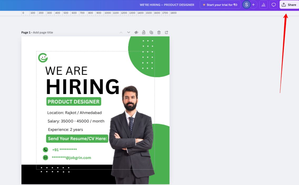
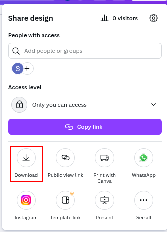
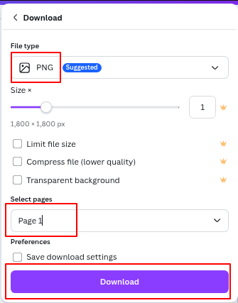
Step 8 – Download the Banner
Go to:
Share → Download → PNG (High Quality) → All Pages [unchecked, you want single]
Guidelines:
- PNG ensures crisp text
- JPG compresses, avoid if text-heavy
- Do NOT export as PDF if posting to portals directly
How To Create Hiring Carousels – PHASE #2 (ATS + Feed Standardized Slides)
4-Slide Hiring Carousel Structure Designers Use Today
| Slide | What to Write |
| 1 | WE’RE HIRING + Role + Salary + Location |
| 2 | WHAT YOU’LL DO (3–5 bullets) |
| 3 | MUST HAVE SKILLS (4 skills + icons) |
| 4 | BENEFITS + CTA to Job Portal |
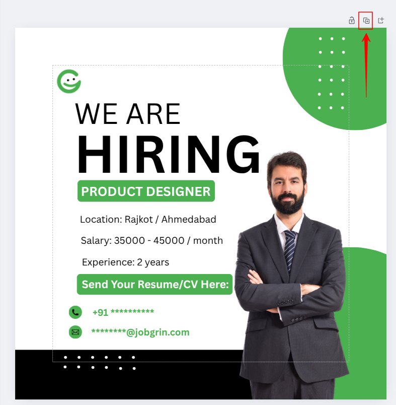
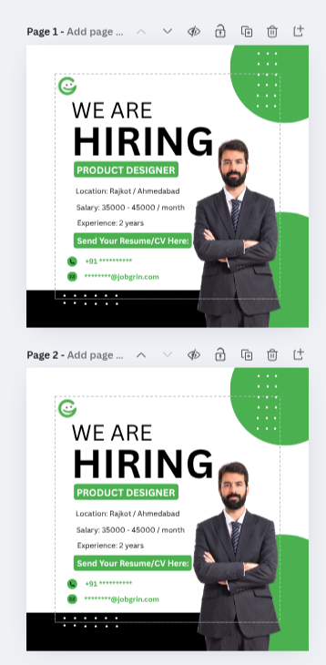
Step 9 – Duplicate Slide Framework
After building the slide one layout, duplicate pages.
Go to:
Pages Panel → Duplicate Page × 3 more
Ensure:
- The header area for the headline remains the same height
- CTA footer stays the same
- Only content bucket changes
Step 10 – Paste Slide 1
WE’RE HIRING
Role: PRODUCT DESIGNER
📍 Ahmedabad | 💰 ₹5–12 LPA | 2+ Years ( according to your location and salary range with experience )
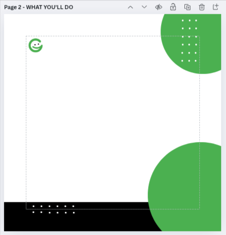
Step 11 – Paste Slide 2: Responsibilities
Remove the content from the second slide that you have copied and add the new content.
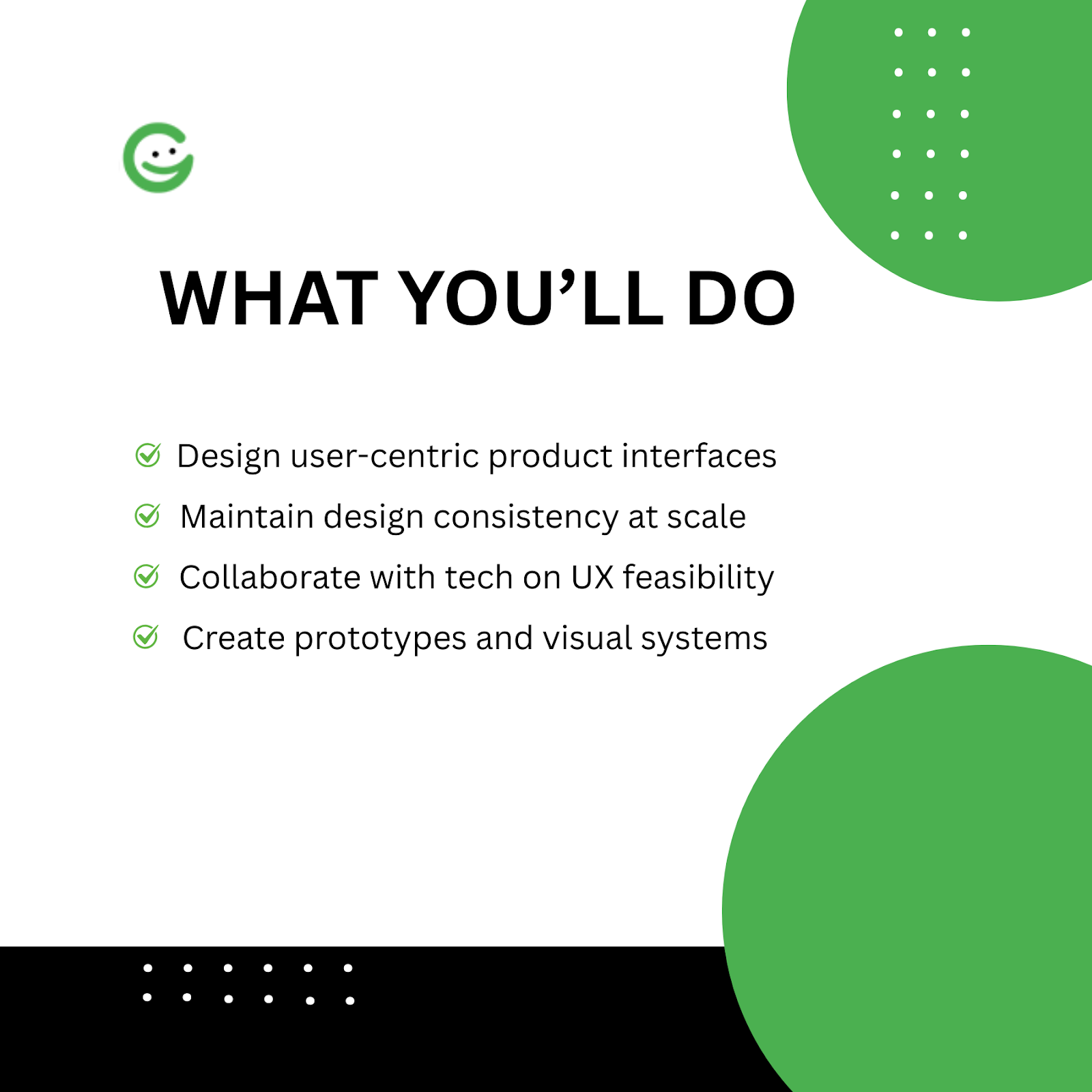
Heading:
WHAT YOU’LL DO
Body:
✔ Design user-centric product interfaces
✔ Create prototypes and visual systems
✔ Collaborate with tech on UX feasibility
✔ Maintain design consistency at scale
Guidelines:
- Use 4 bullets max
- Keep each bullet 1 line
- Use check icons or ✔ for bullets
Step 12 – Paste Slide 3: Skills
Heading:
MUST-HAVE SKILLS
Body:
- Figma
- Design Systems
- Prototyping
- User Research
( You have to add skills depending on the job title )
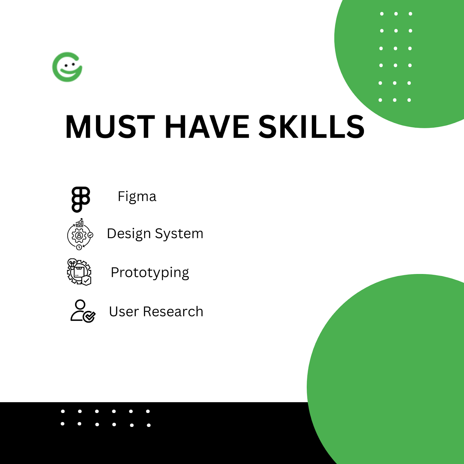
Add icons beside each skill:
Elements → Icons → Insert icon next to each bullet
Guidelines:
- Icon size: 28–32px
- Equal spacing
Step 13 – Paste Slide 4: Benefits + CTA
WHY JOIN US?
✅ Work on real products
✅ Lead visual systems
✅ Fast-track growth
🔗 Apply on JobGrin.co.in
Guidelines:
- 3 benefit points
- CTA box bigger than body text
- Place portal URL heavier for contrast
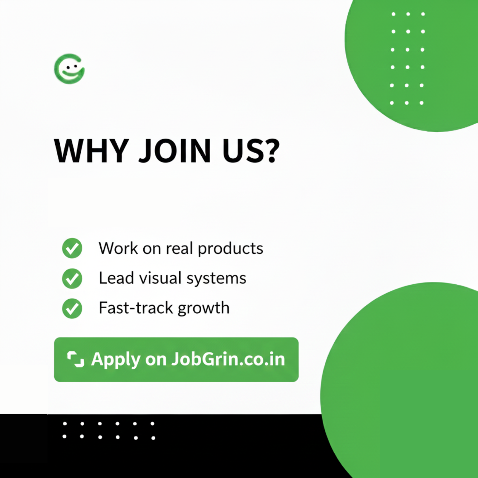
Step 14 – Export Carousel
Download → PNG → Select “All Pages”
Guidelines:
- Post multi-image on Instagram
- Embed the same slides into the blog
Bonus: Designer Tips You Must Include (High-Authority Nuggets)
Typography that never breaks on job portals
- Never exceed 2 fonts
- The role headline must always be dominant
- Do not justify paragraph text — use left align for bullet content
Campaign Color Rules
- Neutral background
- 1 accent color
- Never overload gradients if text is heavy
- Keep contrast AA-friendly
Element Rules
- Use icons to replace big illustrations
- Keep icon size uniform across carousel
- Use soft shadows, not heavy blur glows
Final Conclusion
You’ve learned how to use Canva like a powerful, fast design tool, not just a simple one. You don’t have to waste hours creating a single banner in outdated software anymore. By following these 14 easy steps—like setting up your margins and exporting carousels correctly —you can create visuals for any hiring campaign.
Making your graphics consistent, easy to read, and correctly exported is what makes your posts look professional. Use these tips to make your designs faster, save you a lot of time, and ensure every banner and graphic looks perfect on social media and job portals.
It’s time to use these excellent design skills!
Ready to find a job where your new design skills are needed?
➡️ Find graphic designer jobs on JobGrin to see these banners in action!
Frequently Asked Questions
Why is 1800 x 1800 px the recommended canvas size?
This square dimension (1:1 ratio) offers the best default versatility. It works perfectly for social feeds, fits most job portal thumbnail standards, and maintains high resolution for crisp text and graphics.
Should I export my final banner as PNG or JPG?
Always use PNG (High Quality) for designs that are heavy on text, sharp lines, or brand logos. PNG ensures text remains crisp and avoids the blurriness and compression artifacts often found in JPG files.
How do I ensure my carousels look consistent on all devices?
Always enable Rulers (Shift+R) and establish clear margin guides (e.g., 80px side margins, 120px bottom margin). This ensures your key content (text, CTA) is never cut off on smaller screens or mobile feeds.
What is the maximum number of fonts I should use in a hiring banner?
Stick to a strict maximum of two fonts. One dominant font for the headline and one highly readable font for all body text/bullets. This ensures brand consistency and maintains quick readability.
Can I use my Canva designs for Applicant Tracking Systems (ATS)?
While ATS primarily reads text data, optimized visual templates (like the ones created here) enhance candidate engagement on platforms that feed into the ATS. Always ensure the key information is easily scannable.
Leave a Reply